Sunday, December 16, 2012

The Moon Woman by Jackson Pollock

The Moon Woman (1942) by Jackson Pollock (1912-1956) uses a combination of contrasting cool and warm hues. The lines of this painting are at times curving and free flowing, at other times they are harsh. Use of intense red emphasises the subject of the artwork. Rhythm is created with the different shapes used. Overall scale and proportion are achieved with the combined use of colours and shapes.
This painting could fall under a couple of styles. The first being the most obvious: Abstract. The subject in the painting has been distorted, to the extent, that at first glance the subject is not immediately visible, only on further study of the painting is the woman visible. Expressionism, because it is the artist expression of what he may be seeing, or feeling at the time. It is Nonrepresentational because it does not represent a living being or real life objects.
When I look more closely at the painting, it seems that on part of the woman’s there may be ships or fishing vessels. There are also some sort of symbols to the left of the painting, which may have meaning to the artist. The woman’s eye has a scar in shape of the moon.
Jackson Pollock
                        The Moon Woman 1942
                           Oil on canvas
                         (175.2 x 109.3 cm)
Source: Pollock, Jackson (1912-1956). The Moon Woman. The Solomon R. Guggenheim Foundation, Peggy Guggenheim Collection.
Dec. 10 2012. <
http://www.guggenheim.org/new-york/collections/collection-online/show-full/piece/?search=Jackson Pollock&page=1&f=People&cr=1>


Tuesday, December 11, 2012

Style Comparison & Contrast

    The two drawings that I choose to compare are by the artist Marcel Fromenti (1886-1969) whom was a fashion designer for ‘The Lady’ a magazine started in 1885. I was drawn to these particular pieces of artwork because they don’t automatically come to mind when the term artwork is mentioned. In my opinion they are absolutely gorgeous pieces of artwork.
      
    These drawings represent the artist’s idealized version of what feminine beauty was at the time with long, graceful, curving lines. Each of the drawings is the artist expression of what beauty is in his opinion, with small waists and curving hips. To an extent these drawings are stylized, the subject is clearly definable, yet the artist’s rendering of a woman’s form is clearly exaggerated. Drawn in a fanciful, theatrical, mysterious way, because of the way the subject appears to be carrying themselves, these drawings would also fall under the Romanticized category.
      
    Marcel Fromenti’s first drawing illustrates two women in evening attire. The primary hues are black and white. In the way that the skirts are drawn, they seem to imply a flowing movement. Emphasis is placed on the cinched waist and the elegant way, in which the women seem to be carrying themselves. The models in this drawing are graceful and mysterious; they leave the viewer wondering where they might be off to.
                © Victoria and Albert Museum, London

                 Artist: Fromenti, Marcel (artist)
         Owen Hyde Clark (Designer for Worth London, designer)
           Victor Stiebel, born 1907 - died 1976 (designer)
                      Worth London (designer)
                        Date: 1953-1954
          Materials Used: Pen and Ink, Wash and Chinese White


   In the second drawing is a group of three women modeling casual afternoon attire. These outfits were designed for the French actress Leslie Caron (1931). The lines are soft and curving in an organic way. The dress to the left of the drawing seems to have a velvet or perhaps a satin texture to it. Even though the bottom part of the model is larger than the top half and not necessarily proportionate, the artist still has achieved balance.

 
                               © Victoria and Albert Museum, London
                 Artist: Fromenti, Marcel (artist)
              Givenchy, Hubert de, born 1927 (designer)
          Castillo, Antonio, born 1908 - died 1984 (designer)
                       Lanvin (designed for)
                        Date: 1953-1954
          Materials Used: Pen and Ink, Wash and Chinese White.

Sunday, December 9, 2012

Creative Statement of My Artwork

The project that I have decided to share is one that I am currently working on. I had mentioned in my introduction that I like to quilt. Fabric is one of my favorite mediums to use. At the start of this project, I have a basic high school art education. Credit for the pattern goes to Missouri Star Quilt Company. The name of the pattern is called The Big Star Quilt. The fabric used is by Moda and the line is by The French General. What inspired me to create this project was the vision that I had of the finished project in my head, with my choice of colors and fabrics. I like when I can see something visually and make it come to life.

Before I start a project like this, I either have to have a movie (I like to pop in Lord Of The Rings, even though I have watched it many times, it is long. It is good background noise, and lets me gauge how long I have been working on a project, just one of the small quirks that I have). Listening to some good jamming music, classical or 80’s, really get my creative juices flowing.

So after I have the music or the movie that I want to watch, I make sure that my work area is clean and tidy (even though I know I am going to mess it up again very shortly). Following the pattern, I separated the light and dark fabrics. I then took two white fabric squares and matched them up right sides together with both a light and a dark square. Then I matched up both a light and dark square right sides together. At my sewing machine, I sewed all around the perimeter of the squares. I then brought the sewn squares over to my cutting mat; sliced the square diagonal one way, then turned and sliced the square diagonal the other way. I opened them, and I had four half square triangles. Three square sets makes a star, so I did this to all three square sets.

After I had cut all of my half square triangles, I brought them over to my ironing board. I pressed the seam, then ironed open the half square triangle. After I had enough cut squares for one large star, I pieced and sewed up a mock square, to see if I liked how the colors blended together. When I was satisfied, I laid out the rest of the quilt to see if it was pleasing to the eye. This is where I stopped.

In this quilt there is a contrast between the light and dark textiles. Two primary colors are used, both red and blue. The quilt has movement to it, the stars seem to twirl. Pattern is created by triangles that are turned in different directions, making a star, causing rhythm and movement. All the stars are the same size and in scale with one another. Even though the quilt is 2D, the combinations of the light and dark seem to make the starts jump out at you.
 

Everday Art

       I think some of the most beautiful pieces of art, are everyday items. It’s a shame that sometimes they receive little more than a glance. Case in point; the British Phone Booth, designed by Giles Gilbert Scott in 1924. Yes, it is traditional in the sense, that it is recognized all around the world. However, I believe that this piece of art falls under nontraditional. While it is not on the same scale as a Picasso or a Rembrandt, it is art nonetheless.
    
    The intensity of the primary color red draws the eye in, while clean lines ascend skyward; gradually curving into a gentle arch. The texture of the piece is made of metal and chippy red paint. ‘Telephone’ is written in crisp black letters which contrast with the red. To top it off, a royal crown is emblazoned onto the booth.

My Class Introduction

Area of study: Bachelor of Science, Interior Design

Familiarity with the field of art: In High School I received a basic education in the prescribed art curriculum, which has not been used much out of High School, and definitely needs to be brushed up on. Last summer I traveled to Amsterdam. While there I got to visit the Vincent Van Gogh Museum, that was quite a treat. I my everyday life, my art mediums would be fabric and yarn. I see things visually in my head, and use that skill before I start a quilting or crochet project.

Career goals: My immediate career goals while I attend school would be, to apply myself to the best of my abilities to each one of my courses. Make the honor roll. I believe this is very possible, if I study the selected material and put in the work, time, and effort required. My distant career goals would be to graduate college, get a job in an interior design firm, or own an interior design firm of my own, in a large metropolitan city like London, New York or Paris. Possibly even a job as a set designer.

Areas of interest: My areas of interest are varied, depending on the mood that strikes me. You could say that I am a jack of all trades but a master of none. I enjoy reading. Subcategories would include: Historical biographies, Historical romance, Fantasy, Interior Design magazines. Jane Austen and William Shakespeare are two of my favorite writers. My musical tastes are all over the board. Ranging from Classical music, to Punk Rock and Indie. If I had to pick three I would choose Thomas Tallis, The Ramones, and Regina Spektor. I enjoy black and white films from the early 1900’s to the 1920’s, and period pieces. Two favorites would be ‘Trip To The Moon’ (1902) directed by Georges Melies; as it pertains to the world of art, I would have to select ‘Goya’s Ghost’ (2006) directed by Milos Forman. I also enjoy running, crochet, quilting, baking and writing.

A painting that speaks to me, one that I have always enjoyed would be ‘The Starry Night’ by Vincent Van Gogh (1853-1890). I like the organic shapes used in the painting, there are no harsh lines, it curves and flows. I like the blue hues contrasting with the intensity of the yellow hues. I would say the overall temperature of the painting would be cool tones. There is something calming yet mysterious about this painting to me. I wonder what lies beyond the mountains in the distance and the types of people sleeping in their houses in the village below.

 
                                                          The Starry Night
                                             Vincent Van Gogh (1853-1890)
                                                        Ca. June 1889
                                           Oil on Canvas (73.7 cmx92.1 cm)
                                      Painted in Saint-Remy-De-Provence France
                                      The Museum of Modern Art, New York City

Thursday, December 6, 2012

Andy Warhol vs. Verner Panton Subject and Style

    The subject(s) of a piece of an artwork differs from the style of the piece in that subject represents the story that the painting is telling, the point that the artist is trying to convey. Subject matter can be anything, a human being, a flower, landscape, a previous artist’s work. To use subject matter in a painting, it does not even have to be on this plane of existence. It can be something that dwells in the artist’s imagination, or perhaps a dream.
    Style is the way that the artist chooses to express what they are seeing, their interpretation. Style (as well as subject) can be determined by how the artist is feeling. This can be determined by how large or small the brush strokes are, different shapes, the type of colors they decided to use, or a certain medium. Subject can influence style and vise versa, depending on the artist life experiences, their viewpoints, imagination, creativity, what is going on in the world at the time, popular culture, influenced by other artist.
     The 1960’s saw the Pop Art Movement. This period artist took their inspiration from mass media and popular culture which influence the style at the time. Andy Warhol (1928-1987) is an iconic artist from this period. One of the pieces that Warhol is most famous for is 32 Campbell’s Cans (1962). The subject Warhol’s artwork is the Campbell’s Can. The style in which he decided to paint it in is called Pop Art (late 1950’s-1960’s). Warhol wished to show how everyday items can be art.


Artist: Andy Warhol
Name of the Piece: 32 Campbell's Cans
Date Created: 1962
Medium used: Synthetic Polymer Paint
32 Canvases used. Each Canvas is 50.8x40.6 cm


   During the 1960’s Pop Art movement the Danish were taking Interior Design by storm. A famous Danish furniture designer from that time was Verner Panton (1926-1998). He is most famous for his S stacking chair. The primary subject of this piece is the chair. The style in which it is done is Pop Art (1950’s-1960’s). Verner designed this piece because he wanted to create a chair that was molded out of one piece of plastic.Much of his work is still produced and sold today.I would say this chair is Verner Panton's abstract interpretation of what a chair should be.


Artist: Verner Panton
Name: S Stacking Chair
Designed in 1959/1960 produced in 1967
Weight: 5.5 kg
Material: fibreglass reinforced polypropylene


Friday, November 30, 2012

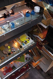
Interior and Architecture Go Hand in Hand

   Below in my own words is how I feel Architecture and Interior Design work together:
 
  Architecture and Interior Design go hand in hand. A building has to be to scale and proportion. Doors, walls, windows all properly placed. Rooms built to the correct specifications. This allows for movement, and cohesiveness through the space.
 
  Interior Design helps bring the space together, uniting both the exterior and interior. The type of furniture used, different shapes, form ,texture and patterns adds personality to the room. The value of colors used in the room can either make the room feel warm (using browns) or feel cool (using blues).
 
  In an open plan space linear perspective is used. Because there are no walls separating the space, the illusion of separate rooms is achieved by using different sizes of furniture and layering colors.

   Another example would be the combining of both modern and traditional interiors and exteriors (which is one of my favorite combinations). Interior Design and Architecture are also combined in office buildings, stores, hospitals, to name a few.

  In office buildings, scale and proportion is used again. When you have many people working in one place, it is essential that the space flows. Interior design comes into play using muted colors to help eliminate distractions. Cubicles need to be properly placed, it would be hard to work with a large amount of people, if space was not properly defined. In both interior and architectural design, there needs to be a degree of practicality.

  Who would live in a building for very long, if they couldn’t move around comfortably, or they were worried that it would cave in on top of their heads.

Examples that I used:

-An example of both Interior Design and Architecture combined in the workplace
Source: http://www.thecoolhunter.net/article/detail/1844/anz-centre--melbourne


-An example of both Interior Design and Architecture combined for living